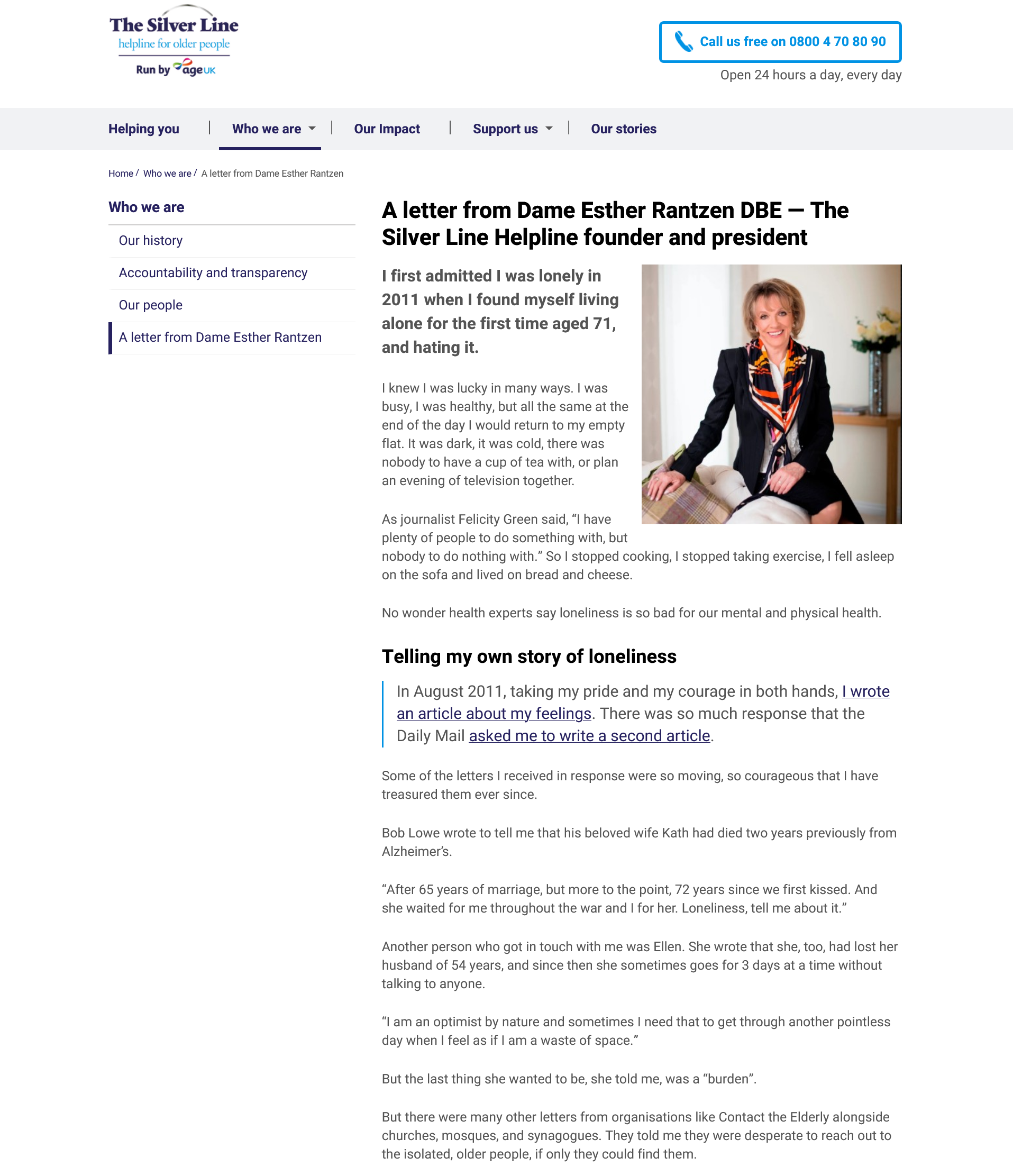
Website
The Silver Line Helpline
Website
The Silver Line Helpline
What the client wanted
When Age UK approached me to plan, manage and write the content for The Silver Line Helpline, I’d already been supporting their busy content team for a few months.
Thanks to this experience, I was already very familiar with Age UK’s tone of voice and brand. However, I had little familiarity with their new sister-charity, The Silver Line Helpline.
Who are The Silver Line Helpline?
During my tenure as a volunteer at Samaritans, I had actually sign-posted callers to The Silver Line Helpline a few times. But beyond that, I didn’t know much about the charity.
The Silver Line Helpline is a charity telephone support line, ran by volunteers and set up by Dame Esther Rantzen to offer free support and help to older people across the UK.
The charity had recently been taken under the wing of Age UK and as such, Age UK wanted to revive Silver Line’s outdated and inaccessible website.
However, both the Age UK team and Silver Line’s directorial board had one significant caveat to project.
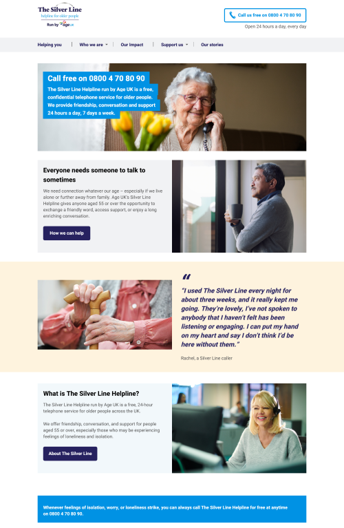
A distinct yet unified tone of voice
While Silver Line needed a new tone of voice, messaging and content, my clients wanted me to retain the charity’s character.
Silver Line needed a voice that was distinct to their unique mission and legacy. But it should still feel like and read as being a part of Age UK.
As an experienced web writer with a familiarity with Age UK’s voice and brand, I was in the perfect position to deliver the project
Plus, I really didn’t want to disappoint Dame Esther!
How I made it happen
Planning, writing and refining the content for The Silver Line Helpline website was an exciting and deliciously challenging project.
Mapping the old site and finding a starting point
The first step was scouring the existing website for useful content. Because it was so old and I was unable access the backend of the CMS, my first job was to map the site out manually, rooting out all the existing pages.
Sod’s law dictated that little of the content was where one would expect to find it but eventually, I completed a “starting point” site map on MS Excel. Once I knew where everything was, I pulled all the relevant content and dived a little deeper into the brief and research.
Creating site structure with UX Design and accessibility considerations
After familiarising myself with Silver Line’s story, history, mission, and future goals, I plotted out a proposed site structure. I used my UX Design experience to structure the site as efficiently and intuitively as possible.
It was especially important for me to ensure the content and structure was created to be as accessible as possible.
With an expected user-base of older and potentially vulnerable people, we knew some visitors might not be familiar with or confident using and navigating websites.
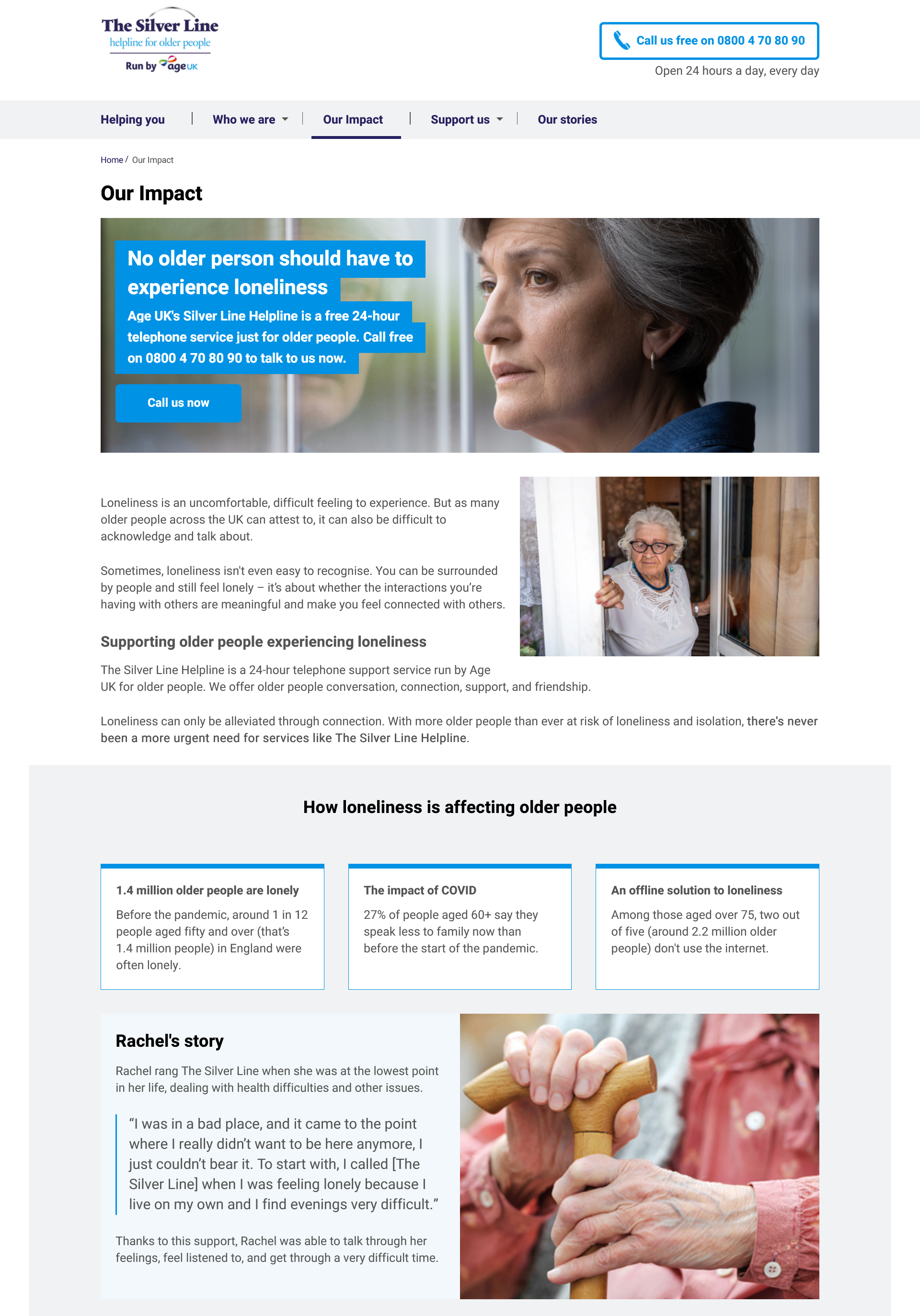
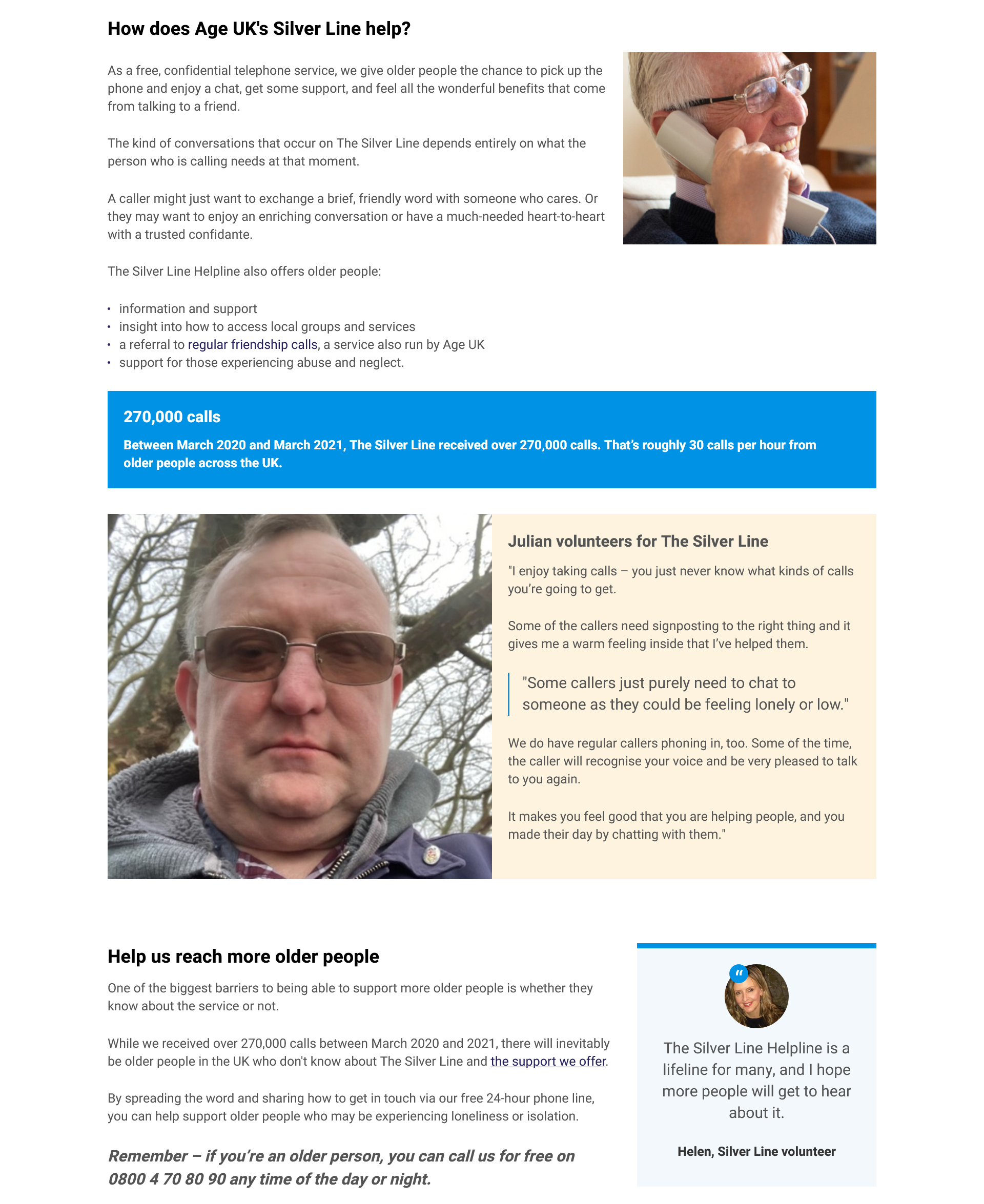
Liaising with stakeholders and writing clear and compelling content
Throughout the project, I worked closely with Age UK’s Content leadership, Dev team and Web Designer. While I worked independently, every significant decision needed their expert input and sign-off.
I also took it upon myself to liaise with teams across Age UK and Silver Line to gather data and secure sign off.
Once we had the site plan OK’d, I got to work writing and drafting content. I wrote the bulk of the site from scratch as there wasn’t a lot salvageable from the old site.
From outlining the charity’s history to distilling its overall purpose and impact into a few paragraphs of text, writing the copy was tough but very fulfilling.
Building the website using Age UK’s CMS
Because there was so much content, I began building the website as I continued rolled out new content to stakeholders for sign-off.
Using the building blocks and ‘look and feel’ designed by Age UK, I used my experience of creating web content via the CMS EPiServer to build each page.
It was really satisfying to see my words on the page; especially as I was also the one putting them up there!

Seal of approval from Dame Esther Rantzen
As is often the case in the world of charity, projects can move fairly slowly. However, we managed to get the website across the line and live in time, thanks to a huge combined effort of the content, design, and dev teams (and myself!).
I had the pleasure of presenting the site to Dame Esther via Zoom back in March of 2022. I was hugely gratified to discover she had only a few pieces of feedback for us. Plus, she shared a very funny anecdote about how she’d roasted Piers Morgan when they appeared on daytime TV together a few years ago. Excellent bonus.
All in all, a job well done and one that I’m still extremely proud of to this day.
